
The brand/technical naming, and use/availability of colours across components/blocks on the site.
Base:
Brand Base colour.
Semantic theme name: Base (Also known as Neutral Primary)
“Use as a background in place of white to add variation and interest to content areas on the page and when white might be too stark.”
Colloquially referred to as Hummus
Available with: slab block
Main brand colours:
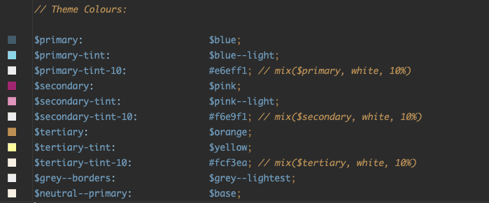
Primary Color
From brand guidelines: ‘Biobank Blue’
Secondary Color
From brand guidelines: ‘Pink (accents)’
Tertiary Color
From brand guidelines: ‘Orange (accents)’ – not suitable for use against white, as this fails contrast
Brand ‘tints’:
The brand guidelines include a lighter version of each of the ‘main’ brand colours in a section called ‘secondaries’; a light blue, a light pink, and a yellow, but these aren’t ideal for [insert design reasons].
A 10% tint of each of the main brand colours above has been created to use as a background color for components:
Semantic theme name: Primary Tint (10%)
A 10% tint of the brand primary/blue.
Available with: box block, slab block
Semantic theme name: Secondary Tint (10%)
A 10% tint of the brand secondary/pink.
Also known as Pink, sometimes also colloquially referred to as Aubergine
Good for limited use on a page to direct to important information, such as security info.
Available with: box block, slab block
Semantic theme name: Tertiary Tint (10%)
A 10% tint of the brand tertiary/orange.
Also colloquially referred to as Carrot?
Good for limited guiding to primary call to action areas.
Available with: box block, slab block
Warning – very similar to Base, good to keep orange tint/hummus well apart.
Other colours:
Offwhite: #EEEEEE
Available with: box block, slab block
Usage of colours:

Code references:
Links to design system? For reference for now…
These shouldn’t change, but the source of truth for colour variables can be found in the GitHub code repo here.